Poster Stamps: Design
“The artistic poster of real beauty proclaims itself gently, but irresistibly, out of the mass of kaleidoscopic color and common design. Few colors in strong contrast skillfully arranged, the fewest of lines and masses, simple chiaroscuro, added to charm, dignity, or vigor of design- these are the elements and essentials; and if the conditions are properly fulfilled the result is an artistic triumph of which any artist might be proud.”
—M.H Spielmann
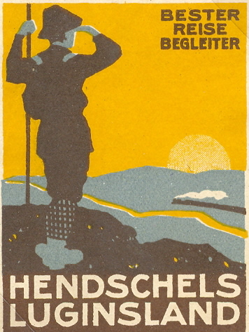
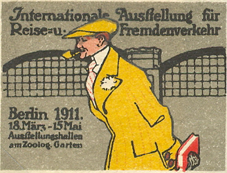
Though advertising was the main intent of poster stamps, they also brought beauty to the masses as a sort of 'common man’s art gallery.' The stamps rely on basic principles of graphic design and include the work of important contemporary artists. Simplicity of shape, form and color are key, as is the goal of grabbing the viewer’s attention in only a few seconds. At the turn of the century, many poster artists also gained inspiration from Japanese prints, with their flattened foregrounds and clear compositions.
Color
| Traditionally, stamps were monochromatic etchings, and some continue to embrace their elegant lines. | Developments in printing allowed artists began to incorporate more color into their designs. |


|


|
|
Monochromatic
|
Color
|

Simplicity
In general, poster stamp design moved away from the intricate lines and shapes of art nouveau, an important international movement in art and design from the 1880’s to the early 1900’s characterized by curving lines, highly designed flowers, and natural motifs.
Art nouveau designs

Flat areas of color, simplified drawing, and strong silhouettes were preferred for their simplicity and clarity. So although beautiful art nouveau detailing persisted the most eye catching and successful poster stamps tended towards simplicity.
Simplified designs


Ludwig Hohlwein: Germany's 'King of Posters'

Within German’s influential school of poster stamps designers, one artist in particular helped to define the poster stamp medium. Ludwig Hohlwein, born in 1874, was one of the most important German commercial design artists of his time.
His designs are identified by their tonal contrasts, interlocking shapes, and blocks of color. A Hohlwein poster almost guaranteed success for a German business. To increase production, Hohlwein is credited with developing new poster-making techniques through light projection and image tracing. During WWII, Hohlwein worked as a propaganda artist for Germany, a period much criticized in following years.
The influence of Hohlwein is evident in this stamp. Note the smooth repetition of line, offset yet balanced composition, flat colors, and clear delineation of form.
| Home | Poster Stamps | Poster Stamp Design | Poster Stamp Iconography |